|
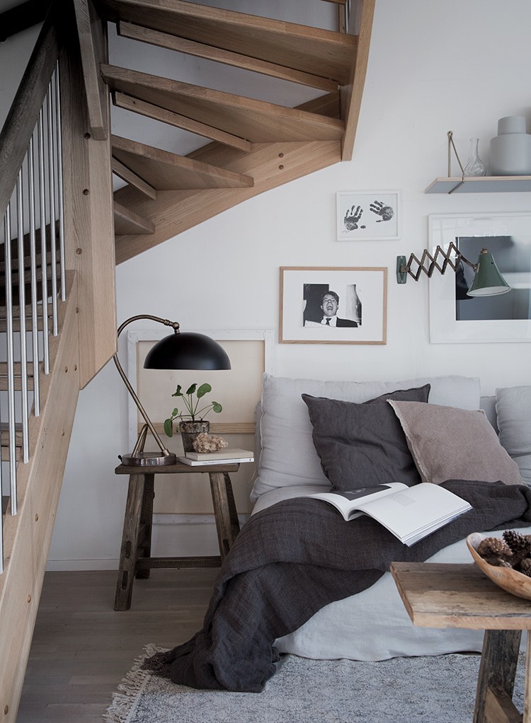
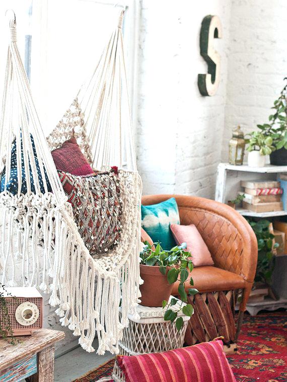
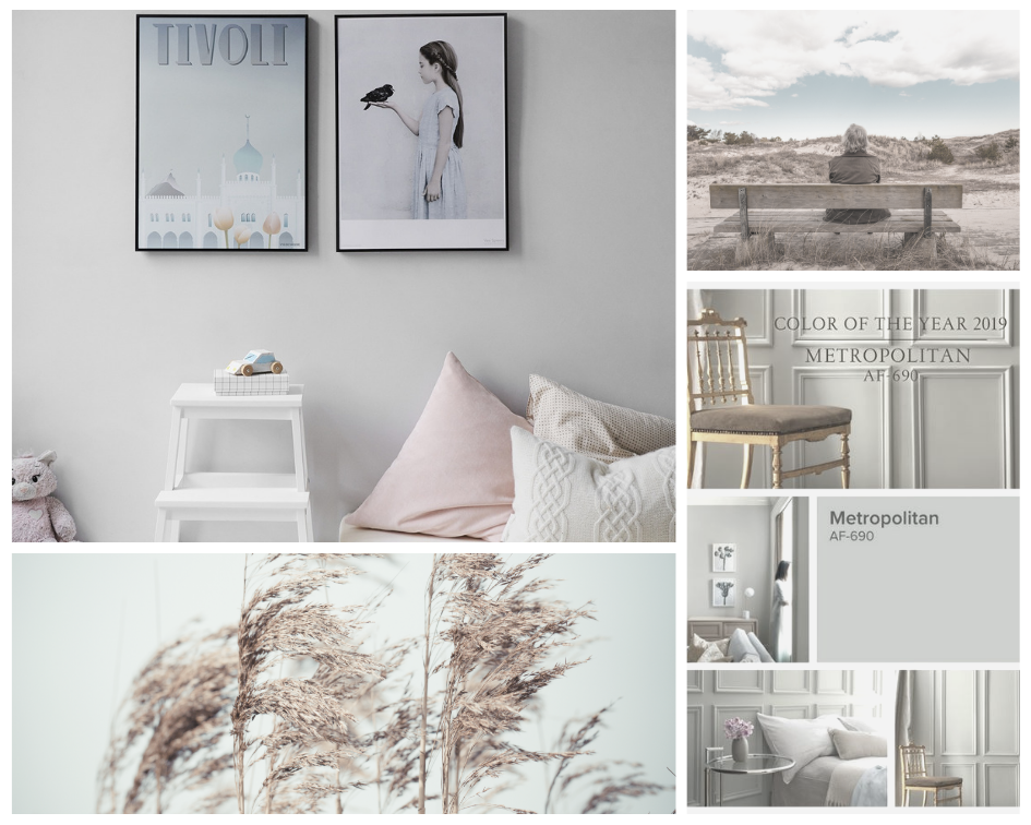
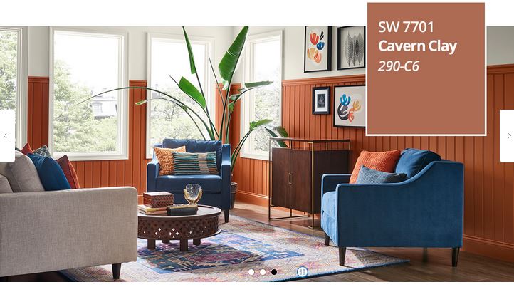
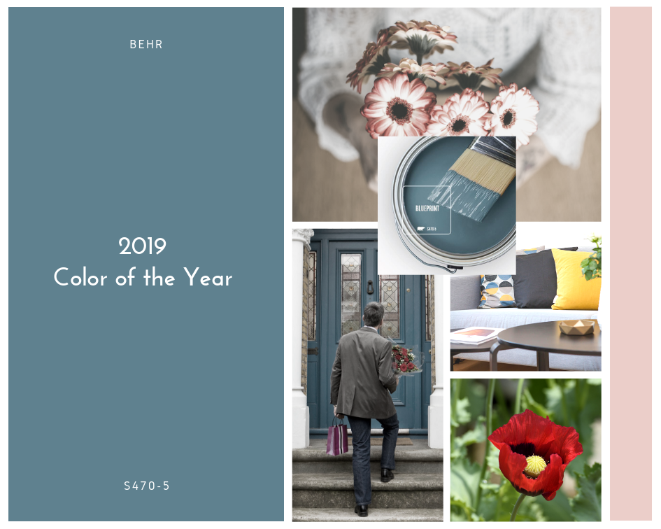
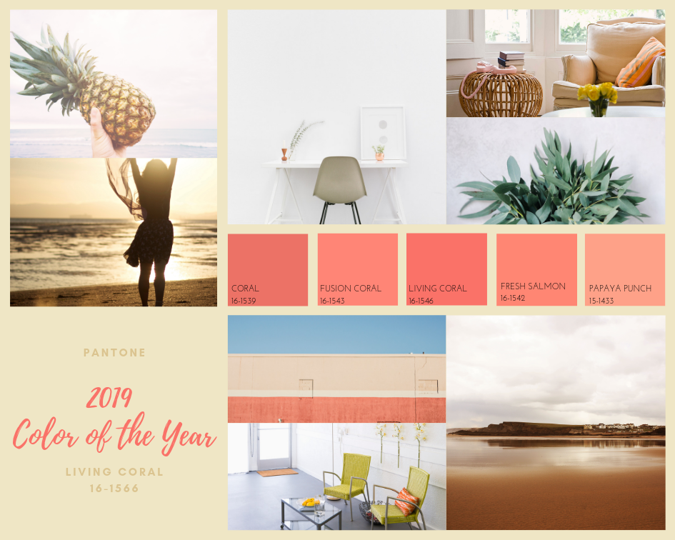
If you are in the mood for a spring refresh, we have so many gorgeous color schemes to choose from right now! Grays are still "in" for 2019 and while I fully support choosing any color that makes you happy when decorating, be aware that we are seeing a warming trend. If you plan to sell in the next few years, make sure to choose shades with warm undertones so you don't fall prey to the inevitable flux of design style...cool grays have numbered days, so enjoy them now and be on the look out for a gradual return of warmer shades in the coming years. Once a month, vendors from hundreds of miles around would pour into Canton, Texas for First Monday Trade Days. The term "shabby chic" had just been coined, if you wanted barn wood you had to go find an old barn or look in a junk heap, no one had heard of ship lap or American Pickers, and Pinterest wouldn't become a "thing" for almost another decade. It was a beautiful time of treasure hunting, scouring flea markets, haggling with vendors, and re purposing! Treasures didn't get Pinned, Tweated, or Shared. They got used, and loved. You shared your creativity with friends who came over and admired your resourcefulness. Gallery walls of chippy window sashes, repurposed miss-matched china, fence pickets turned into wall hangings, and the overall farmhouse vibe...while still alive and well in every Hobby Lobby...are being replaced with a more modern, mid-century take involving natural fibers, raw wood, nature-inspired colors and lines, and a Scandinavian flair. Interestingly, we are seeing two very different up-and-coming style trends emerging. Most prominently we have a clean, mid-century inspired minimalism accented with nature-inspired colors and textures. We are also seeing a return of the maximalist, bohemian vibe (which to be honest, I wouldn't have predicted...though I can't say I mind, I love this look when done well). As for 2019 Color Trends, there are so many wonderful options to choose from. Whether you are inspired by the calm, clean, minimalist grays or want something saturated and full of life, 2019 has something for you. Benjamin Moore Metropolitan AF-690 Benjamin Moore's 2019 Color of the Year is gorgeous...and I mean, swoon-worthy, take yourself to the paint store right now gorgeous! Metropolitan AF-690 is a cool gray but flirts with a warm undertone in certain lights. It's a classic gray that can read with bluish undertones. Beautiful against white, and espresso stains or grayish oaks; best avoided if the space has anything close to yellow'ish oak (90's I'm looking at you). Sherwin Williams Cavern Clay SW 7701 To be honest, this is not my favorite color. It's a beautiful, warm, natural tone when used in a natural way and has a strong place here in Colorado where it's well suited to the area. But it's a bit hot when used as a wall color and you have to be in the right mood to enjoy it. If you love this shade, pull it in through accessories in main living areas...if you just have to paint something, opt for a small space with lots of natural light! If you use this shade in a dimly lit space without natural light "Cavern Clay" will likely live up to it's name: the color of a dirty cave. Behr Blueprint S470-5 This is another 2019 home run when it comes to paint selection. It's a lovey shade of saturated, yet slightly muted, blue. Just like your favorite pair of jeans, it looks gorgeous with everything! This is an excellent base color as it beautifully showcases just about any accent color you pair it with. Reds, pinks, oranges, greens, yellows, warm and cool neutrals. If you are looking to go dark, this is an outstanding choice. If you want to keep your walls light and bright, consider this shade for larger pieces (sofas, accent chairs, bead spreads, base cabinets/islands or vanities, front doors). Pantone Living Coral 16-1566 While I wouldn't recommend you run out and start painting every wall in your home with this gorgeous hue, I would recommend you pull it in as an accent color! Living Coral is a beautiful, extraordinarily versatile, medium shade of coral, perfectly balanced between pink and orange. It pairs well with cool and warm tones, and is the perfect accent color to welcome in spring, and carry you through summer and into fall decorating.
2 Comments
|
OneNest News
Make sure to catch all the latest One Nest news, updates and posts by following us on Facebook and Twitter! Archives
May 2019
Categories
|


 RSS Feed